Ishara

A brand identity that is, itself, a sign.

"Ishara" means sign in Swahili, a name already set before we began. The brief was clear but not simple: colors calm enough to resonate with Deaf users, and a mark simple enough to be instantly recognizable, yet real enough to carry meaning. We went through several rounds before landing on a mark that reads as the letter "I," Ishara's first letter, while also functioning as an actual Kenya Sign Language gesture.

Branding Visual Identity Brand Guidelines
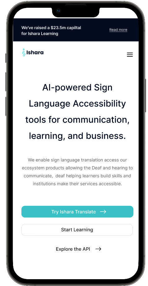
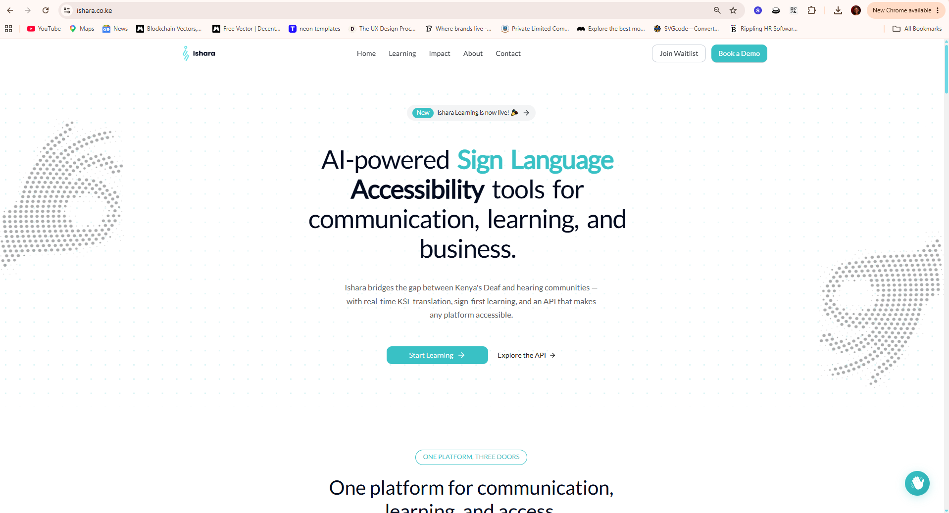
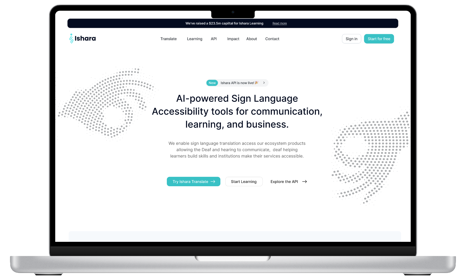
Ishara product website homepage, showing the full brand identity applied to the live platform
Pending asset ishara-assets/ishara-website-hero.png Hero shot of the Ishara website homepage, showing the identity applied live.
01

A name that already meant something

The company came to us with "Ishara" already chosen, sign in Swahili. That gave the identity work a clear north star from day one: whatever we designed had to live up to a name that was already doing half the job.

02

Finding the mark, the hard way

We went through multiple rounds of exploration before landing on the final logo, a form that reads first as the letter "I," but on a second look reveals itself as a real KSL sign. It had to work both ways: recognizable at a glance, meaningful up close.

03

Color chosen for calm, not just contrast

The brief asked for colors that would resonate with Deaf users specifically, not just look good on a pitch deck. We built the palette around that constraint first, prioritizing calm over noise, before layering in the typography and pattern system that carries it across every touchpoint.

Ishara's typography and color specification sheet
Pending asset ishara-assets/ishara-typography-color-spec.png Typography and color specification sheet — to be added once the spec sheet is finalized.
04

A motif that carries where it's from

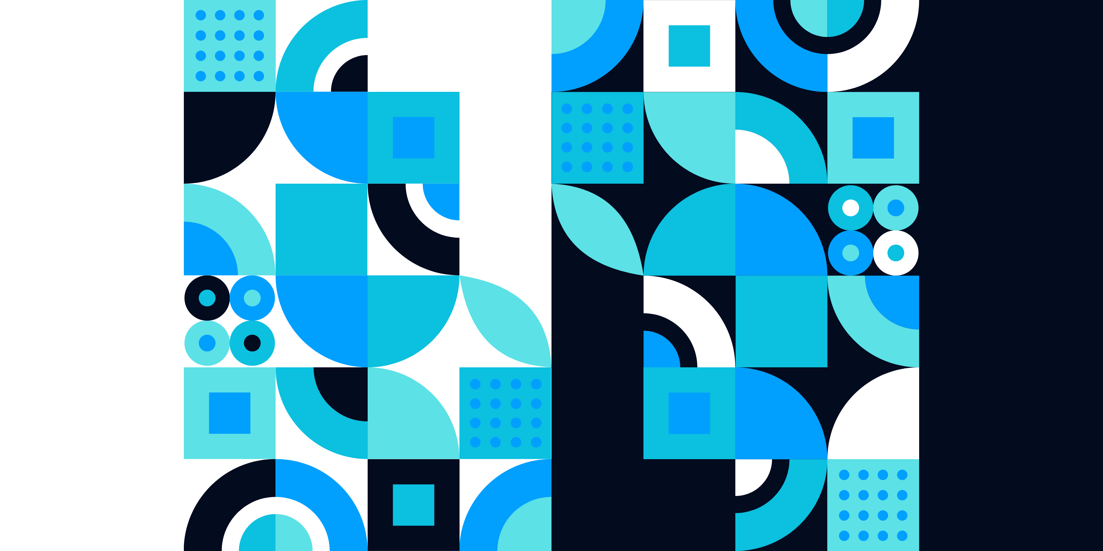
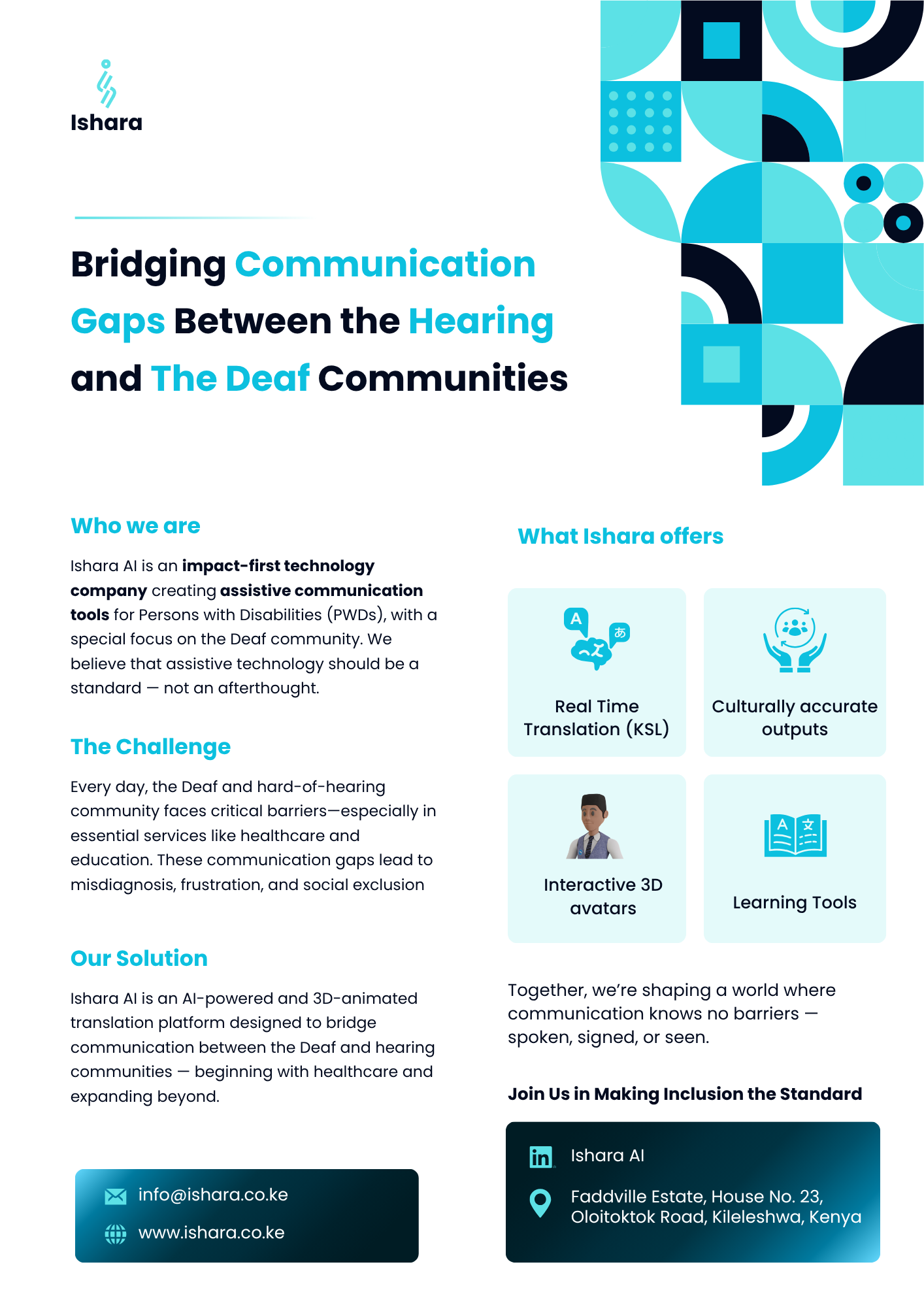
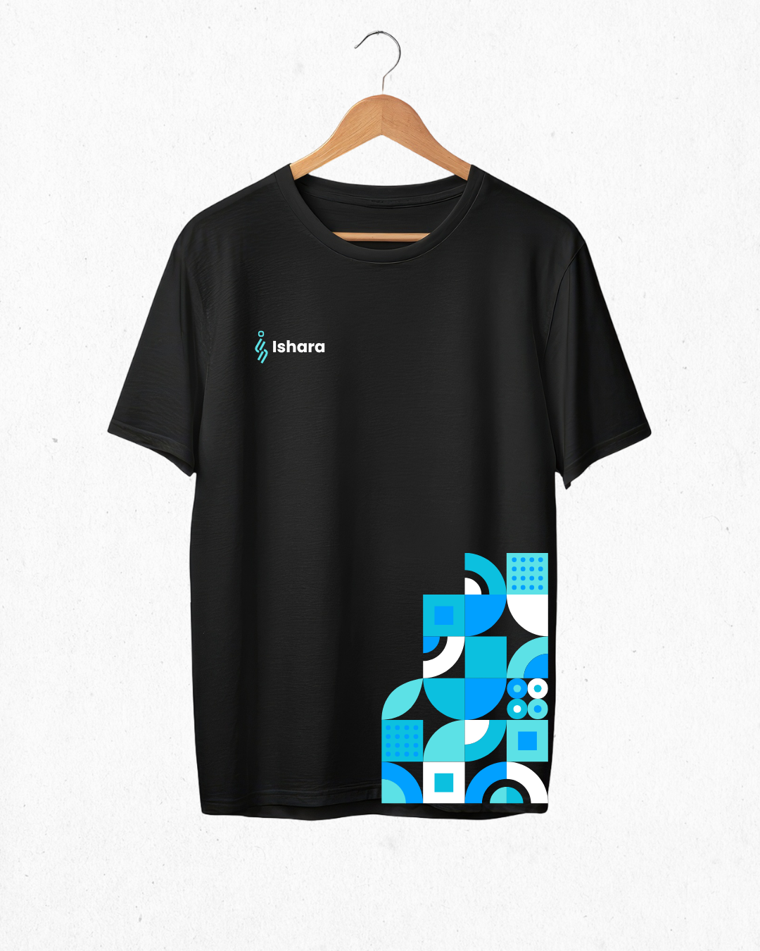
Kenya shaped more than the name. The geometric pattern running through Ishara's flyers and banners draws on African print traditions, bold, graphic, built from repeating shapes, reworked in Ishara's own color language rather than a literal reproduction. It's the piece that makes a flyer, a banner, any future material read as unmistakably Ishara, recognizable before you even reach the logo.

Ishara's geometric pattern motif, drawing on African print traditions in the brand's own color language
Pending asset ishara-assets/ishara-pattern-motif.png The geometric pattern motif on its own.
05

The Ishara Brand Guide

Once the mark, palette, and pattern were locked, we packaged all of it into the Ishara Brand Guide: logo usage and clear space, the full color system, typography, and the rules for how the pattern motif can — and can't — be applied. It's the reference that keeps every new flyer, banner, and product surface consistent as Ishara grows past this first rollout.

06

The identity in the real world

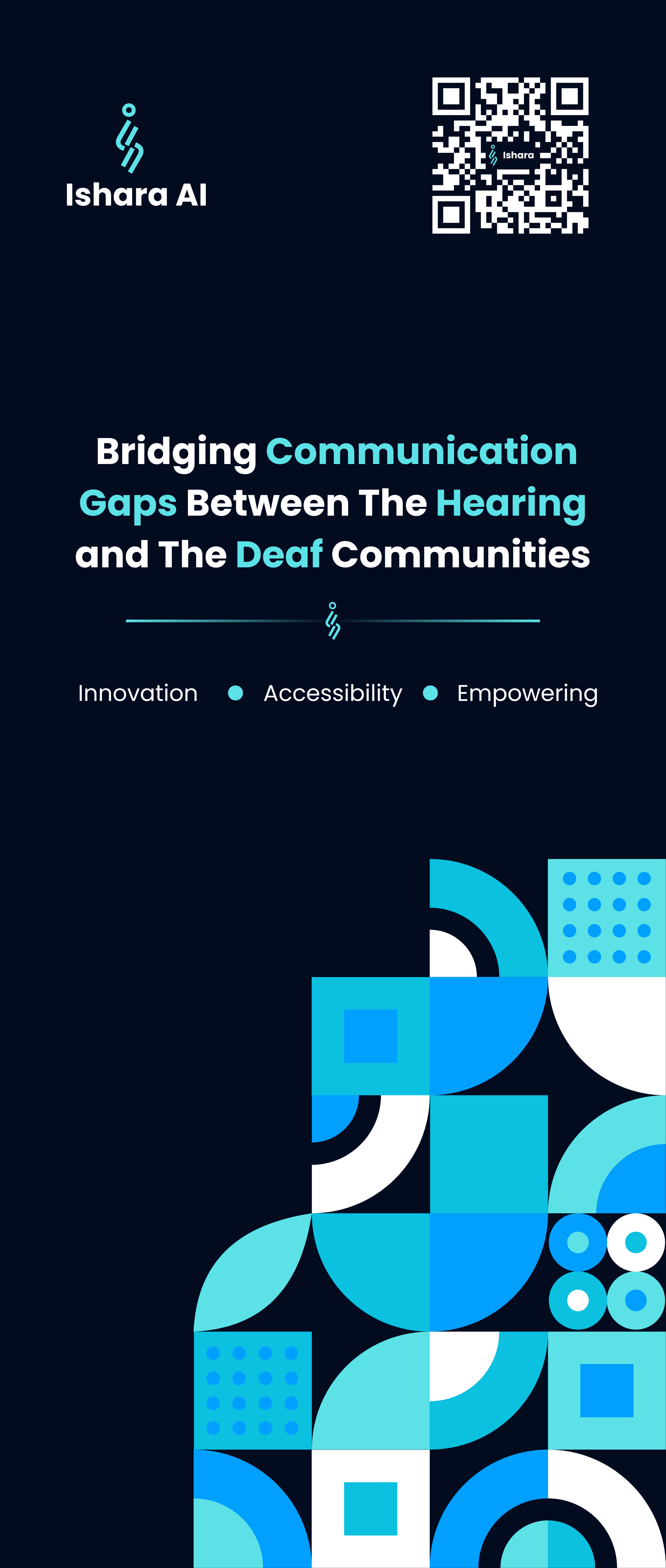
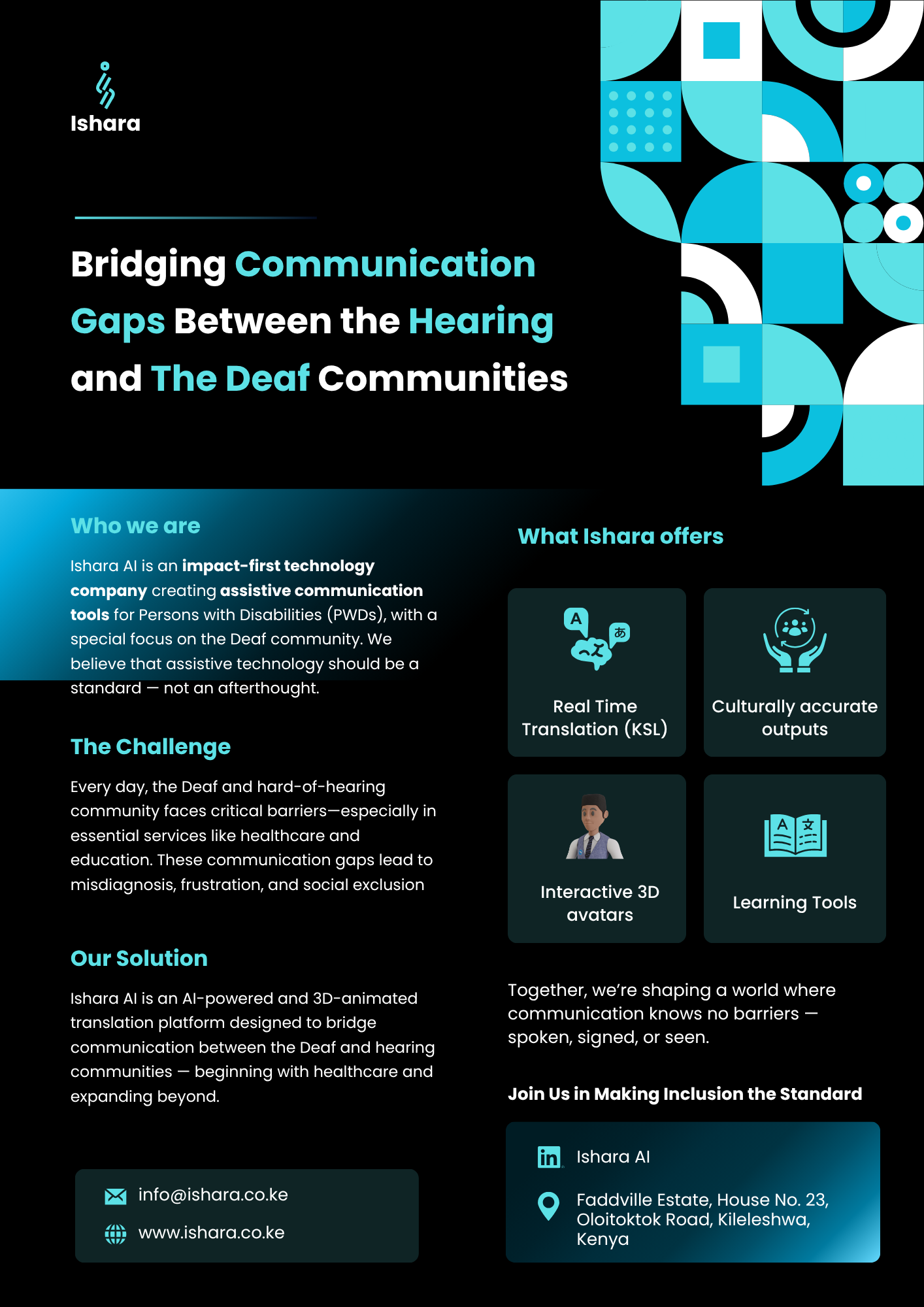
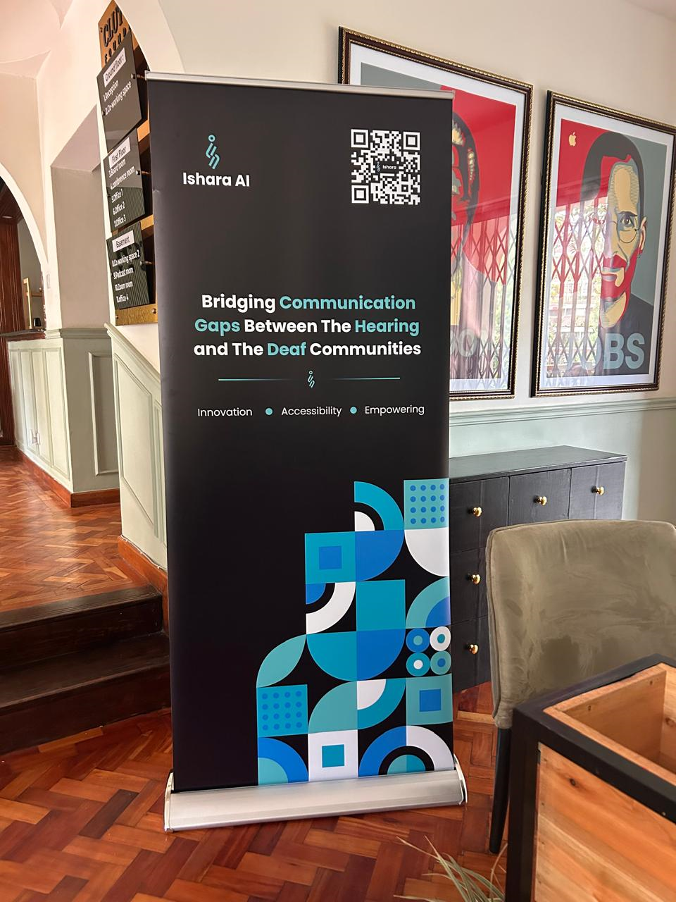
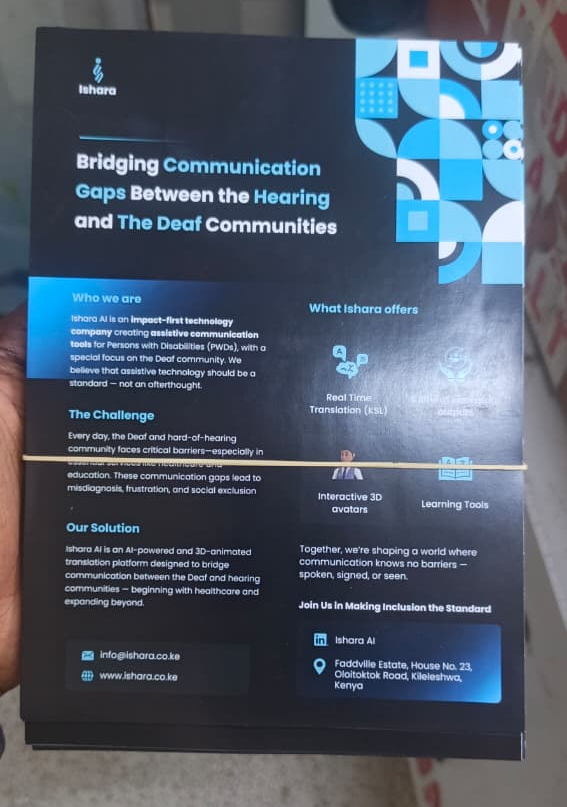
The pattern motif and palette carry straight off the screen and onto physical collateral — a roll-up banner for events, a flyer for outreach — without being reinvented for print. Same shapes, same color logic, same read, just resized for the room it's standing in.

The Ishara roll-up banner displayed in a real event setting
Pending asset ishara-assets/ishara-banner-in-context.png The roll-up banner shown in a real setting.
An Ishara flyer shown in a real-world outreach setting
Pending asset ishara-assets/ishara-flyer-in-context.png The flyer shown in a real setting.
07

Built to work everywhere

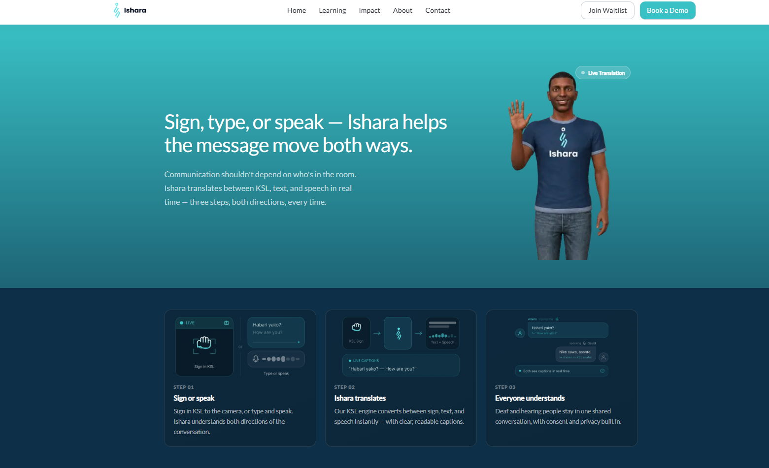
The identity had to hold up in the product itself, not just on marketing collateral — same palette, same type, same pattern language, from a full desktop layout down to a single mobile screen. Including the 3D avatar Ishara uses to demonstrate signs, which needed its surrounding UI to feel just as calm and legible as everything else in the brand.

The Ishara logo shown mocked up on a device
Pending asset ishara-assets/ishara-logo-device-mockup.png The logo mocked up on a device.

An identity that doesn't explain sign language. It uses it.

"I love how professional these slides are btw, clean and well structured. Worthy of a UI/UX company."

Tony Mashin
Software Developer